All projects

Case study

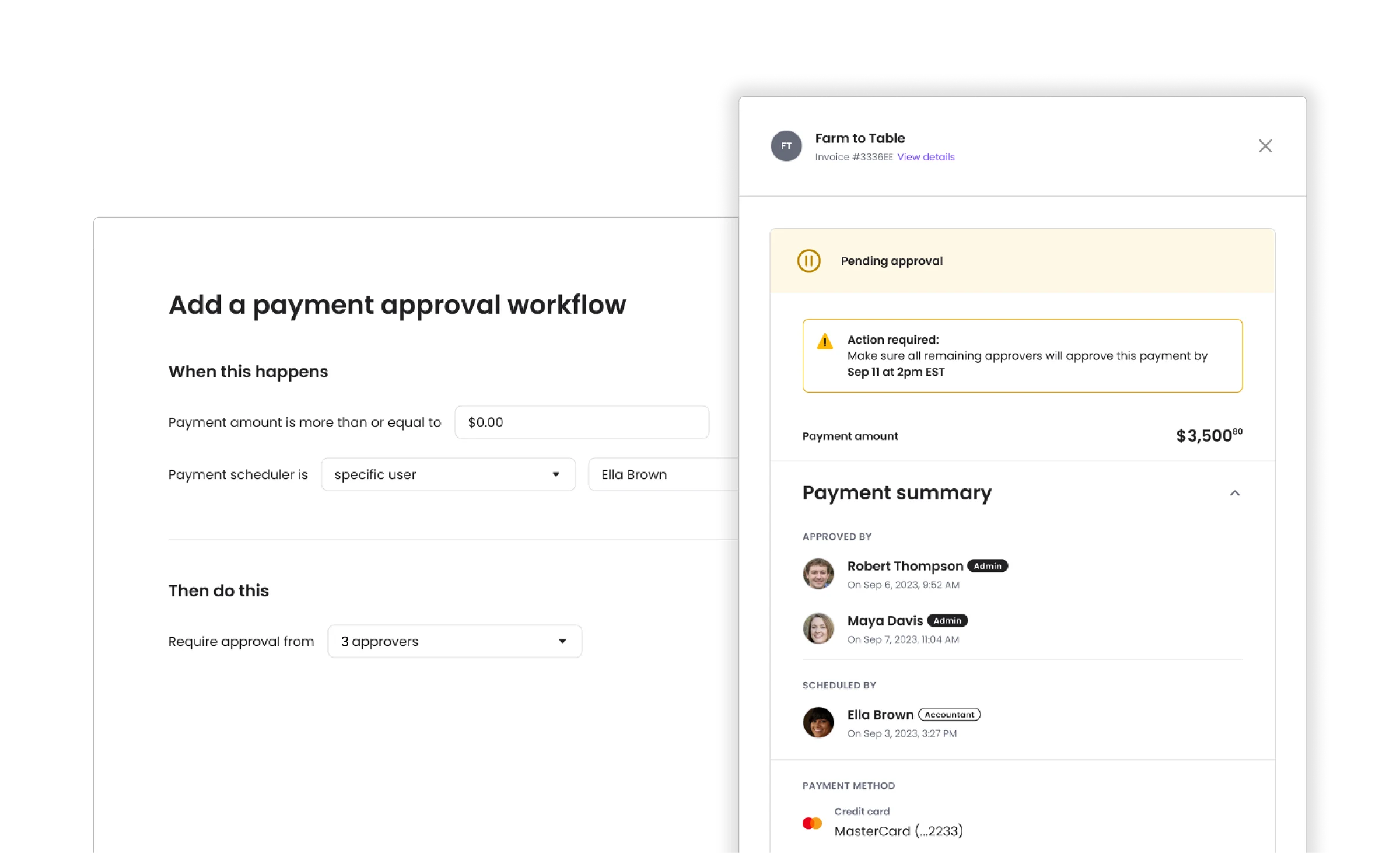
Approval workflows - Made payment approvals simple to set up, without limiting how complex they can get.

Melio is a B2B fintech platform helping small businesses manage vendor payments. For businesses where several people handle payments, not just the owner, every payment meant chasing whoever could approve it - by email, Slack, or phone - before it could go out.

My role was to design the system that replaced that guesswork: conditions set once that route every payment to the right person automatically.

Company
Melio
Timeline
Q4 2023 · 3 months
Team
1 PM, 1 Design, 1 Writer, 4 Dev
Tools
Figma
Melio approval workflow screens: a dialog setting a rule for payments over an amount with two required approvers, a users and roles list, an approver's table of payments pending approval, and a payment details drawer showing who approved and who scheduled it.

Research

I studied finance tools and automation builders, then chose the plainest model

Before designing, I looked at approval flows in other finance tools, and at wider automation tools built for general workflows. Melio’s users are small business owners, mostly non-technical, who run a business and use Melio as one part of it.

Flow maps with branches and intersections suit people who build automations all day. I chose the opposite on purpose: a screen an owner can read as a sentence, and change by editing a word or a number. Later versions changed the layout but kept that reading.

Phase one

I built it on what users and competitors were already telling us

We had a close relationship with support and go-to-market at the time. Their input, combined with that research, gave us a real map of what owners actually needed and what the market already offered. Phase one was grounded entirely in that evidence - conditions and approval logic based on real requests, not assumptions.

It worked, and it covered a real range of combinations. But it wasn’t built to flex - if research turned up a new condition or scenario, it would mean structural changes, not just an added option. Our PM flagged that risk early.

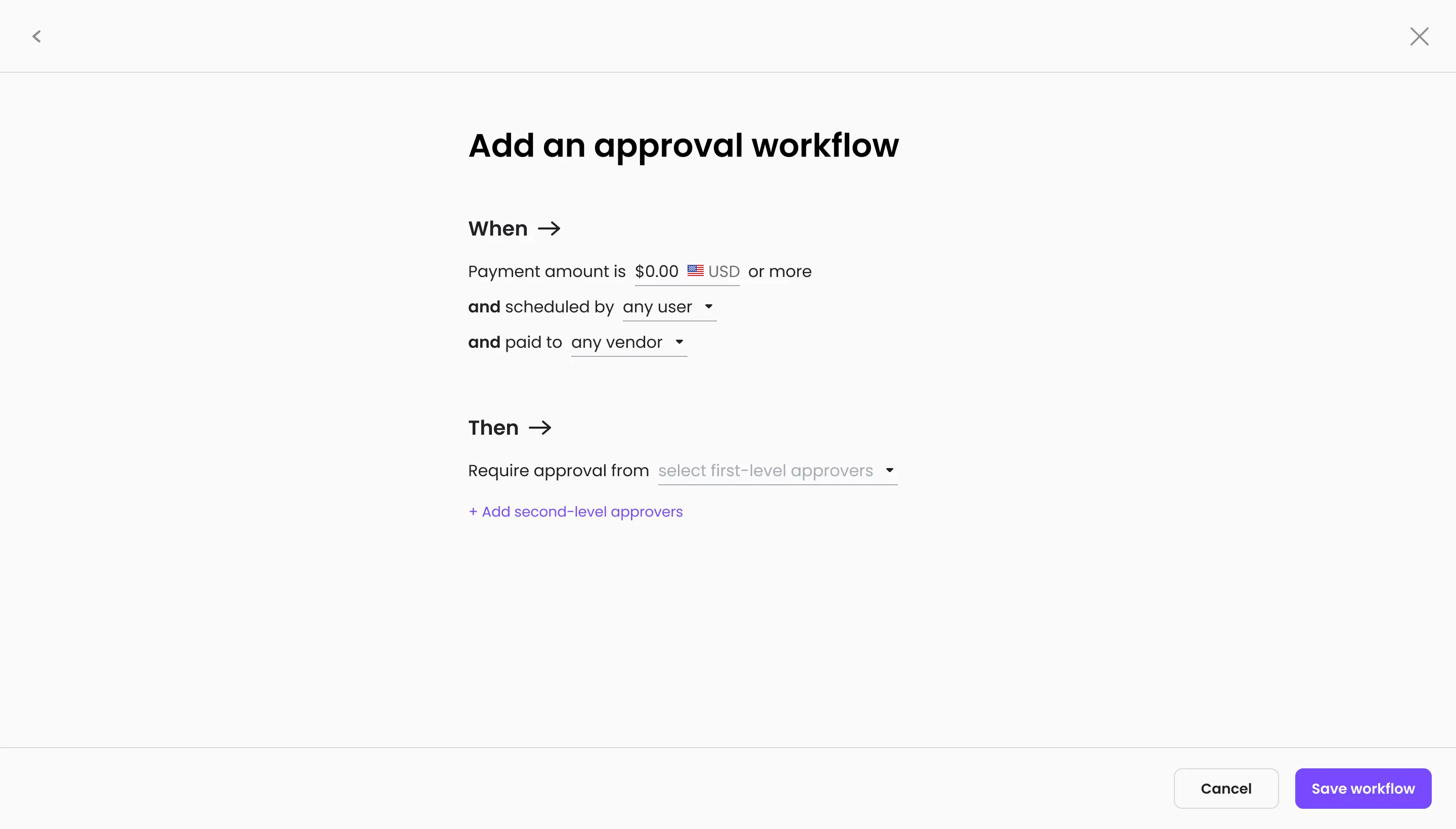
A When block over a Then block, with an option to add a second level of approvers.
All conditions and approvers on one screen, written as a sentence

Phase two

I expanded it to hold what might come next

Instead of only what users had already asked for, I stretch-tested the design with a wider, theoretical scope: future requirements, and shifts that post-release research might cause. We invented conditions we hadn’t seen yet, just to be sure we were covered if changes like that came. The design moved from a single sentence to a table-like structure that could hold that growth.

Once the structure held, I narrowed the content back down to phase one’s scope. At that size a full table was more than we needed, so I simplified it into horizontal forms. Then a business deadline hit, and the full scope had to ship far sooner than planned.

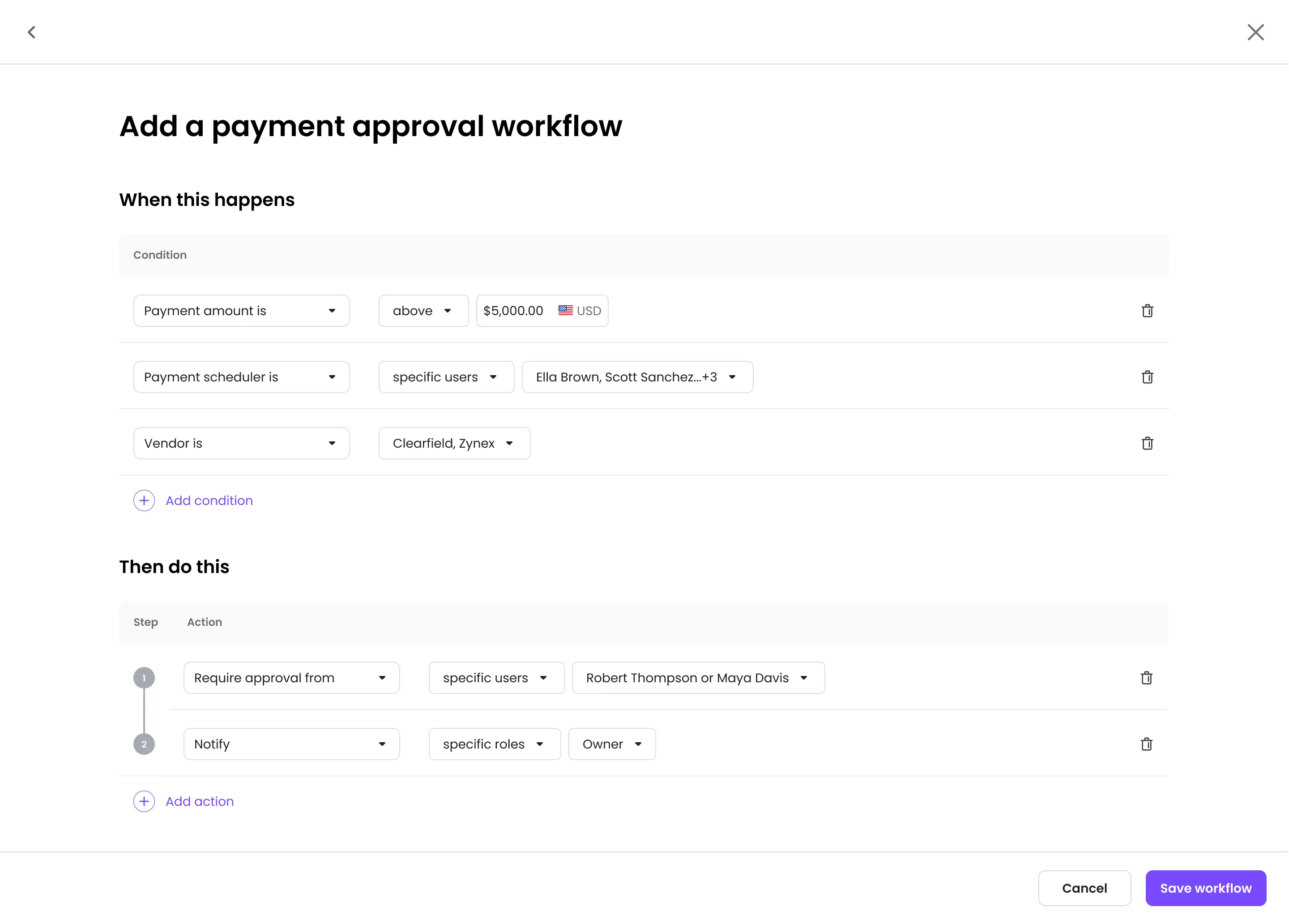
The workflow builder, split into the conditions that trigger a workflow and the steps it then runs.
The stretch test: more conditions than we’d likely need, in a table-like layout
Each condition is a row of dropdowns with its own delete control, and actions are numbered steps.
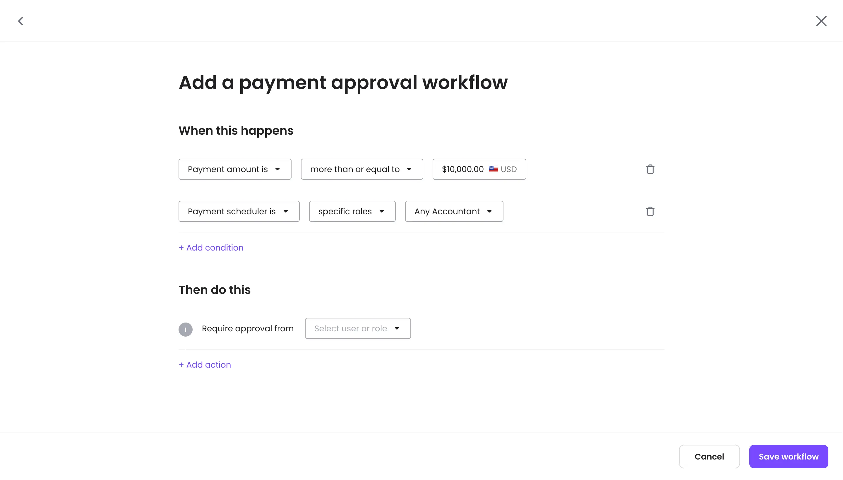
The table-like layout, simplified into horizontal forms, with the content reduced back down

Phase three

A business deadline forced a cut. I kept the wider structure so it could scale later

The schedule was tight, so I set the scope together with developers, weighing each piece against the effort to ship it on time. I knew this had to scale, so I kept phase two’s horizontal forms rather than reverting to phase one’s sentence.

This one screen was part of a project that spanned seven major areas of the product: entry points and states, workflow creation, approval process, user management, desktop and mobile, emails and notifications, and partner integrations. It took wide thinking from design and development alike, and approval workflows became a core part of Melio’s payment infrastructure, not just one feature among many.

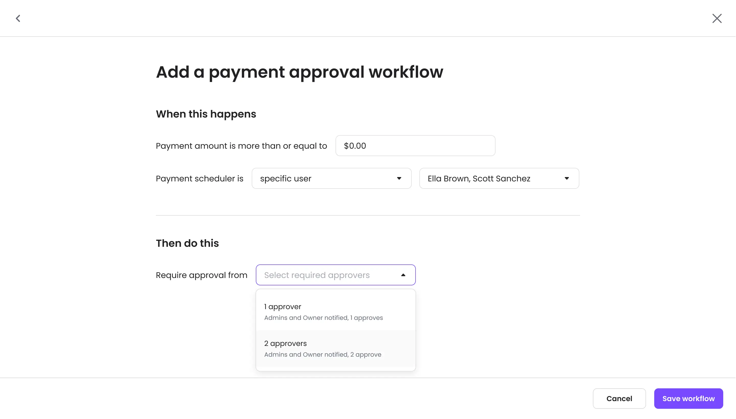
The approver field open, each option naming how many approvals are needed and who is notified.
What shipped: the reduced scope, in the same horizontal forms

Melio platform

Built for more than one partner

Melio’s platform team builds core features like this one as white-label components - designed once, then matched to each business partner’s own branding and product, rather than redesigned per partner.

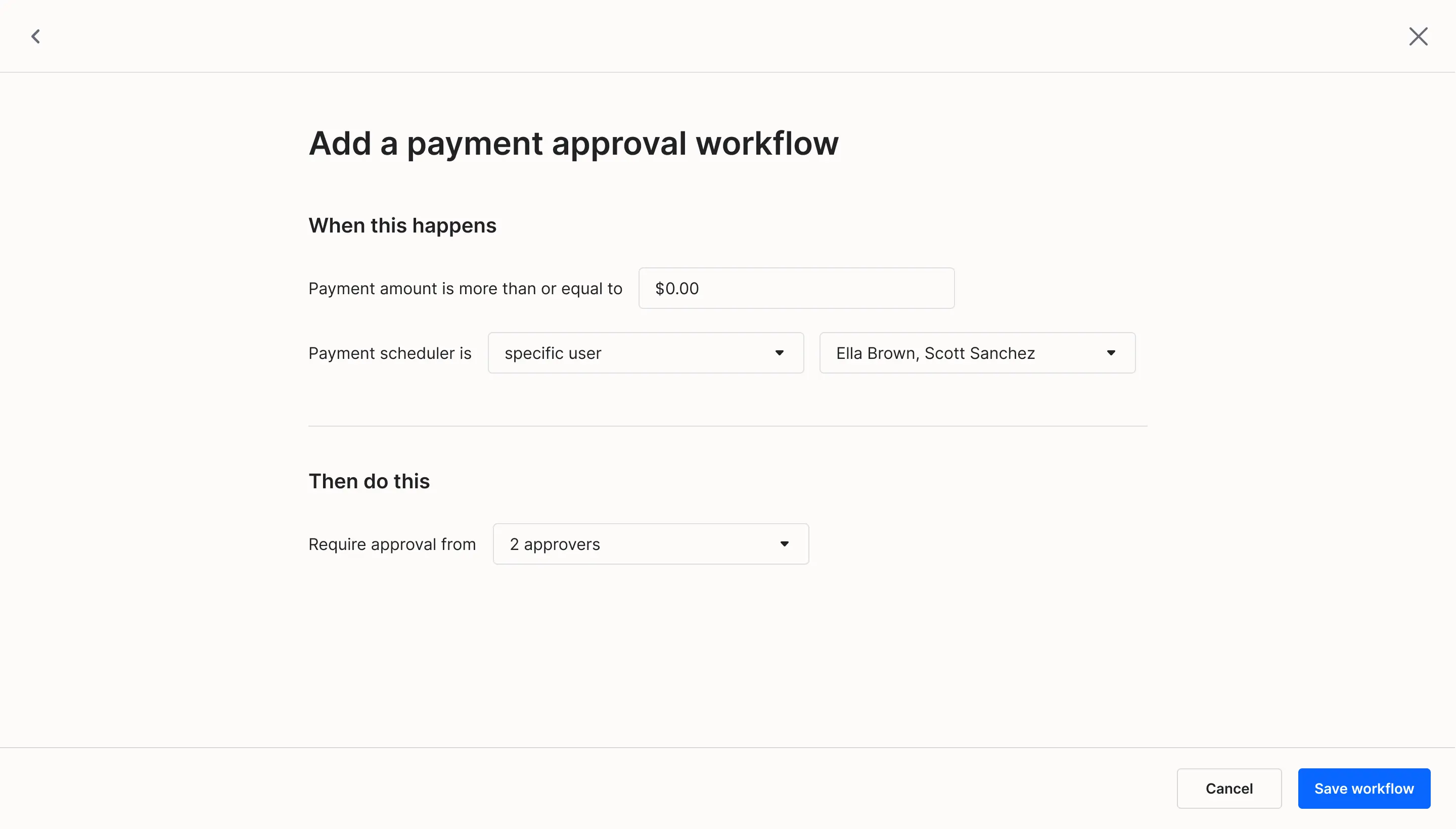
This screen, applied to a different partner, shows that same structure holding up outside Melio’s own interface.

The same screen with a partner’s colors and typography

Takeaway

What I learned

A constraint can save a project

Talking it through with our dev lead, she pointed out something that stuck with me: we were lucky this got cut down by business pressure, because the full scope was genuinely massive infrastructure. A forced constraint can do what good planning alone sometimes can’t - it wasn’t just a limitation we survived, it was what kept the project from collapsing under its own ambition.

Plan for future, design for now

When you’re building something that’s genuinely core, an infrastructure other features will depend on - it’s worth designing, and testing, for scope beyond the current release, so the structure holds as requirements shift.

From a point of view of products built in 2026: this mindset is less relevant for smaller or experimental features, where modern tools make rebuilding fast and cheap. But for foundational pieces, getting the shape right still matters just as much.